

o’hare
A redesign of the app for O’Hare international airport.
5 Week Project | Spring 2023
Project focus: UX/UI

the problem
With 9 concourses, O’Hare Airport is a transportation hub in Chiago, IL. Despite its importance, the O’Hare app is poorly designed. This leads to confusion and makes it difficult for consumers to navigate the airport.
the goal
Redesign the O’Hare Airport app to improve the customer experience by establishing hierarchy, order, and simplicity.
research

Original App
The current app for O’Hare airport is cluttered and leads to a more difficult customer experience. The goal of the redesign is to make the app more intuitive to navigate.
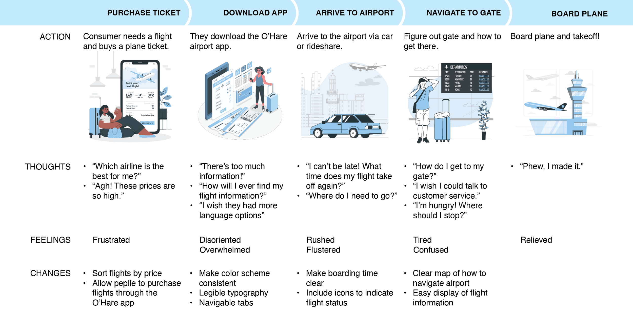
Customer Journey Map
Identifying potential pain points of a customer’s experience purchasing a plane ticket and getting to their flight.
design solution
Wireframe


Simple, sleek
Easy-to-recognize icon
App Icon
Welcome Screen

Clear selection page
Language selection

Clear Icons
Hierarchy of information
Flight Information


Easy Navigation


Quick customer service access
Easily Navigable Map


